STREKALOV
Quiet luxury, in motion. A calm, light stage — all energy and colour belong to the work. A confident grotesque, a cinematic pace, nothing extra.
The logo system
One identity in three carriers: the wordmark is the base, the emblem is for tight spaces, the lockup for representative ones. Always one warm black — the mark carries no colour.
The word STREKALOV in the grotesque Onest, Bold (700), caps, +0.18em tracking. The base of the brand — site, layouts, documents, e-mail signature. Black (#140700) on light, white on dark; transparent PNG above.
Two drops resolving into an S. The only graphic sign — where the wordmark is too small or won't read: avatar and app icon, the favicon, a video watermark, a stamp, the end-of-reel logo sting. White on dark, black on light.
A ready 1000×1000 square — Instagram, Telegram, YouTube, WhatsApp, an avatar in any service. The emblem sits centred with room for a circular crop. White on dark, black on light. Nothing else goes into the avatar.


Emblem plus wordmark on one line. The representative version: deck cover and final slide, the header of a proposal, partnerships and co-branding, a banner, merch. The emblem always sits left; spacing and proportion are locked — never rebuild it by hand.
- Clear space around any carrier — no less than the height of the emblem.
- Only warm black #140700 on light, or white on dark. The mark has no colour.
- Never stretch, skew, or alter the drops’ proportion or the wordmark’s tracking.
- No shadows, outlines, gradients, or backing plates behind the mark.
- On a busy background — only over a scrim or clean field; contrast is mandatory.
Neutral stage
Base. The site ground.
Cards, clean surfaces.
Primary text & buttons. Warm near-black.
Dark zone & footer. Near-black, faint green.
Secondary text, descriptions.
Tertiary text, hairlines.
Principle: colour comes only from the clients' work — never from the brand. The palette itself stays neutral: paper, warm black, a deep dark zone and greys. On that stage every reel looks more expensive. Buttons, links and UI carry no colour. The lower zone and footer morph to Deep in one scroll-driven beat.
A single warm accent — the “изюминка” — is held in reserve for later: very rarely, sparingly, deliberately. Never on buttons.
Onest · Inter
The grotesque Onest — wordmark, headings, big numbers. Inter — all running text, meta, captions. No serifs. Sizes and columns measured 1:1 from COLLINS; the typeface stays ours.
12 columns, the col-2 line
- Container (shell): max 1324px, gutters, centred.
- 12 columns, 24px gap. Eyebrow at the edge, content from the col-2 line, description/manifesto from col-6.
- Radii: 14px (frame), 24px (card), 40px (panel).
- Rails are full-bleed: they start on the content line and bleed off the right edge.
Slow and expensive
- Reveal — fade + upward rise as it enters the viewport.
- Scroll-fill — descriptions fill grey→ink word-by-word on scroll.
- Card hover — the whole card grows from its bottom edge; the image inside doesn't zoom.
- Marquee — the by-the-numbers row scrolls continuously, pausing on hover.
Buttons & surfaces
- Buttons — just two: solid Ink or outline. No coloured fills.
- Cards — white, 24px radius, a thin ring, no hard shadows.
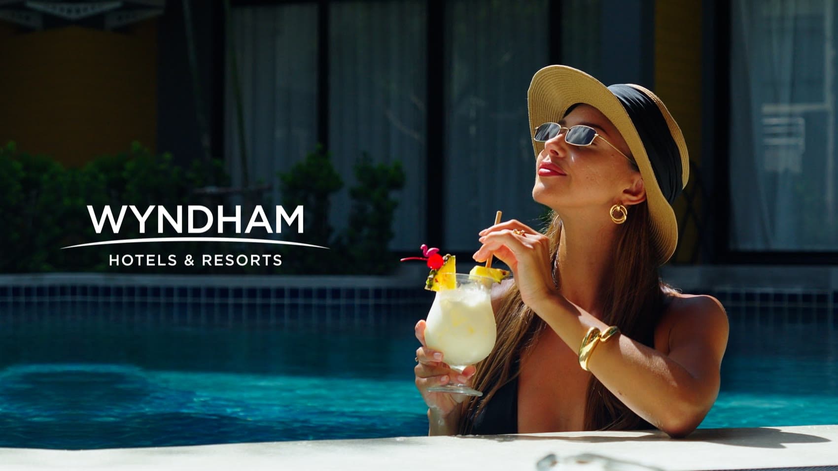
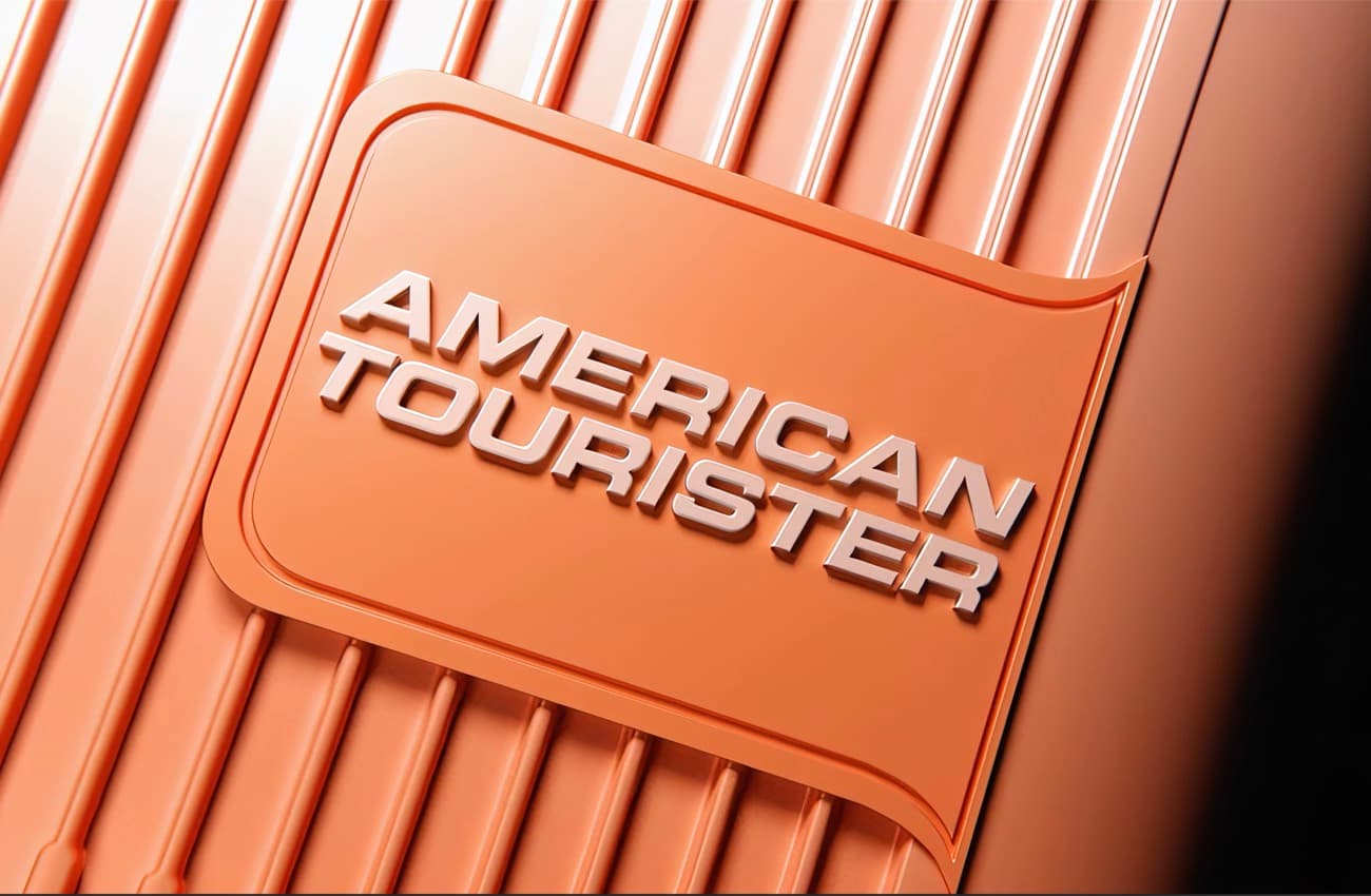
- Client logos — unified to one ink tone via a mask.
- The link arrow (↗) appears only on row hover.
- Sliders: the case deck, media rails, press cards.
The stage, in-feed


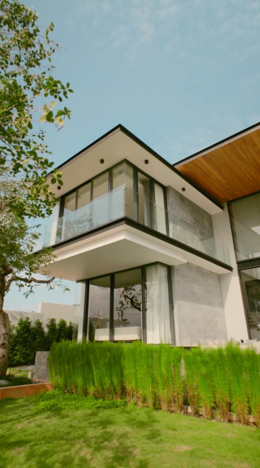
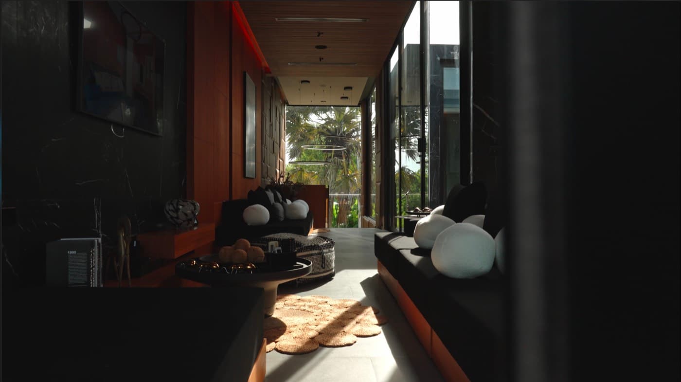
We shoot what sells.
in apartments sold over 6 months
Tell us about your project
strekalovmedia.com- Format 1080×1350 (4:5), 80px margins. Onest for phrases and numbers, Inter for captions.
- Logo only on the cover and the final slide. One thought per slide.
- Numbers — only real ones, always with the project name.
- Colour comes from the frames; text slides stay Paper, White, Ink.
- Per row of three — at most one text card; text cards run diagonally.
- Reel covers — a clean frame, no type on top.
- The avatar and the feed tone never change per campaign.
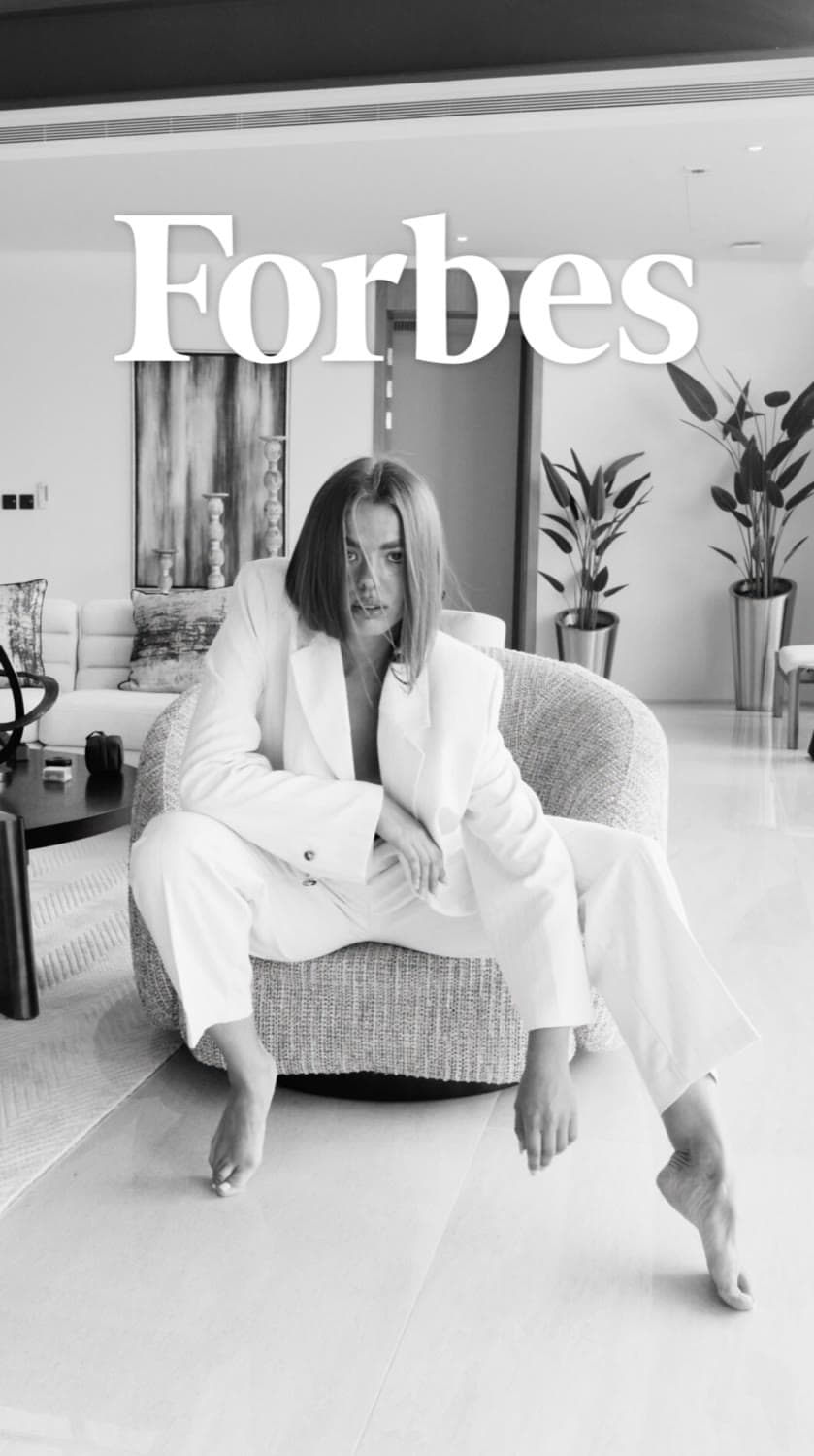
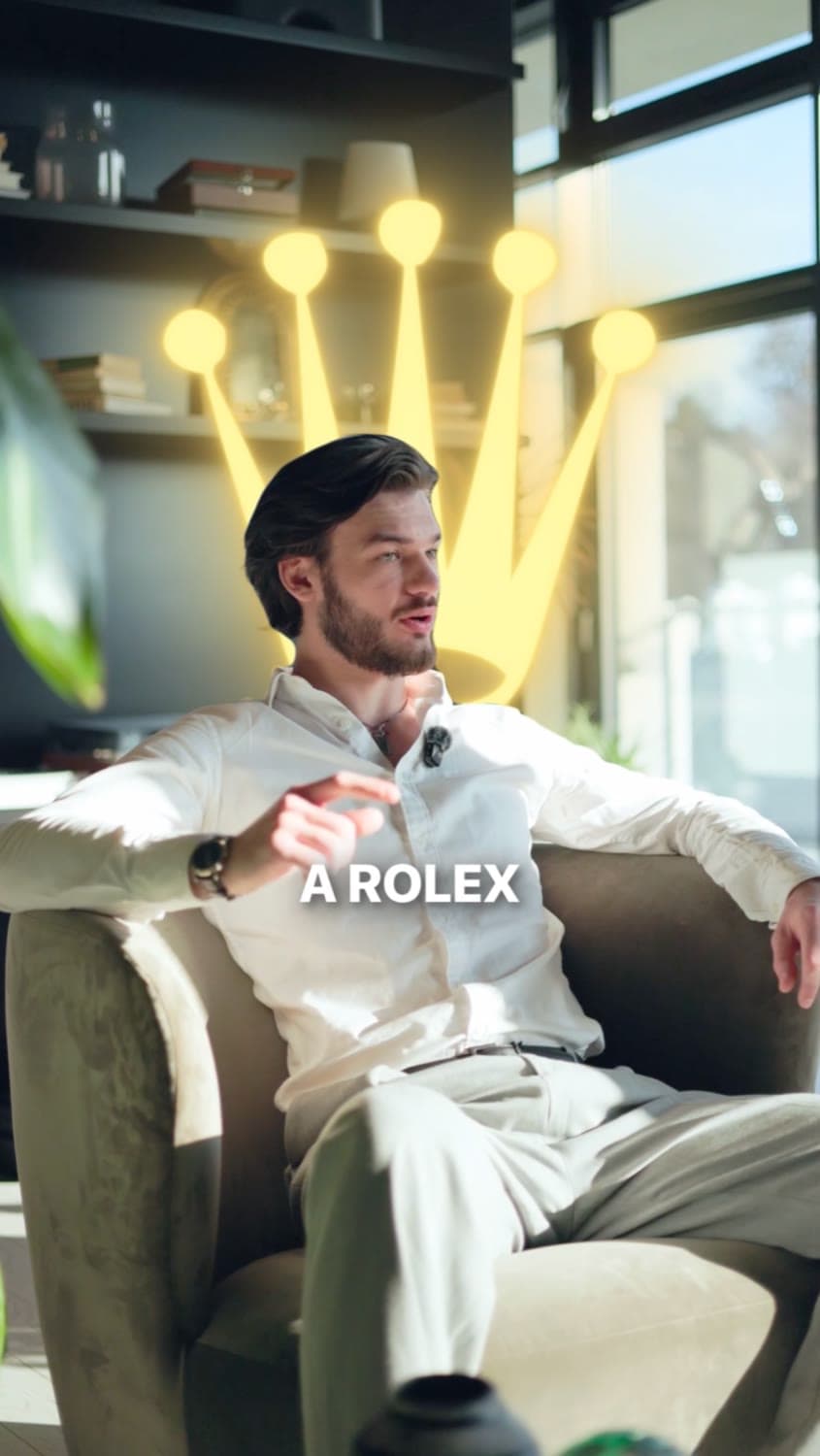
- 1080×1920; keep ≈250px top and bottom clear — that's Instagram UI.
- Type on video — a Paper plate with Ink text, or light text on a soft veil.
- One thought, two lines max. Real numbers, with the project name.
- No stickers, GIFs or gradients — the frame brings the colour.
About worth, not services
- Short, confident, declarative.
- Sell status and outcome.
- Bilingual, clean RU / EN.
- Numbers — only real ones.
- Hype, exclamations, emoji.
- “Turnkey”, corporate filler.
- Long paragraphs, bullet soup.
- Invented metrics.
“Views that bring clients.”
“Make them stop. Make them remember.”
“Worldwide. One standard.”